Updated: 07 December 2021
As previously announced, we’ve been progressively rolling out our brand new look and feel on our market-leading software, GameDay Passport.
You would have noticed a number these updates in various parts of GameDay Passport, however the biggest change is yet to come! A refresh of the User Interface (UI) and User Experience (UX) for Membership, Competition management and all additional modules on GameDay Passport will continue to be rolled out during the remainder of 2021.
This will encompass a new layout with the main menu navigation moving to the left panel and a brand new look and feel throughout.
Here are a few things to look forward to as part of this product refresh:
- Incorporate our new GameDay brand, look and feel
- Standardise components, buttons and screens throughout
- Mobile optimisation of high-traffic pages
- Improve access to Product Updates, GameDay Community & GameDay Support
- Other related workflow improvements, enhanced layout and improved navigation
Users will soon be able to familiarise themselves with the new layout by toggling between the current and new layout before we phase out the current layout in the coming months.
During this time, your feedback will be welcome to help us ensure GameDay Passport is as user friendly as possible. Please email your feedback to [email protected]
Below are some design screens of the new layout of GameDay Passport:
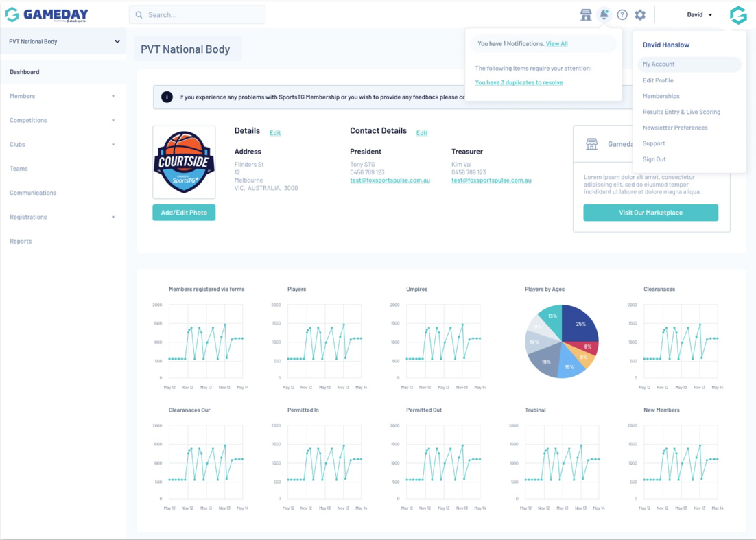 |
| Dashboard Screen |
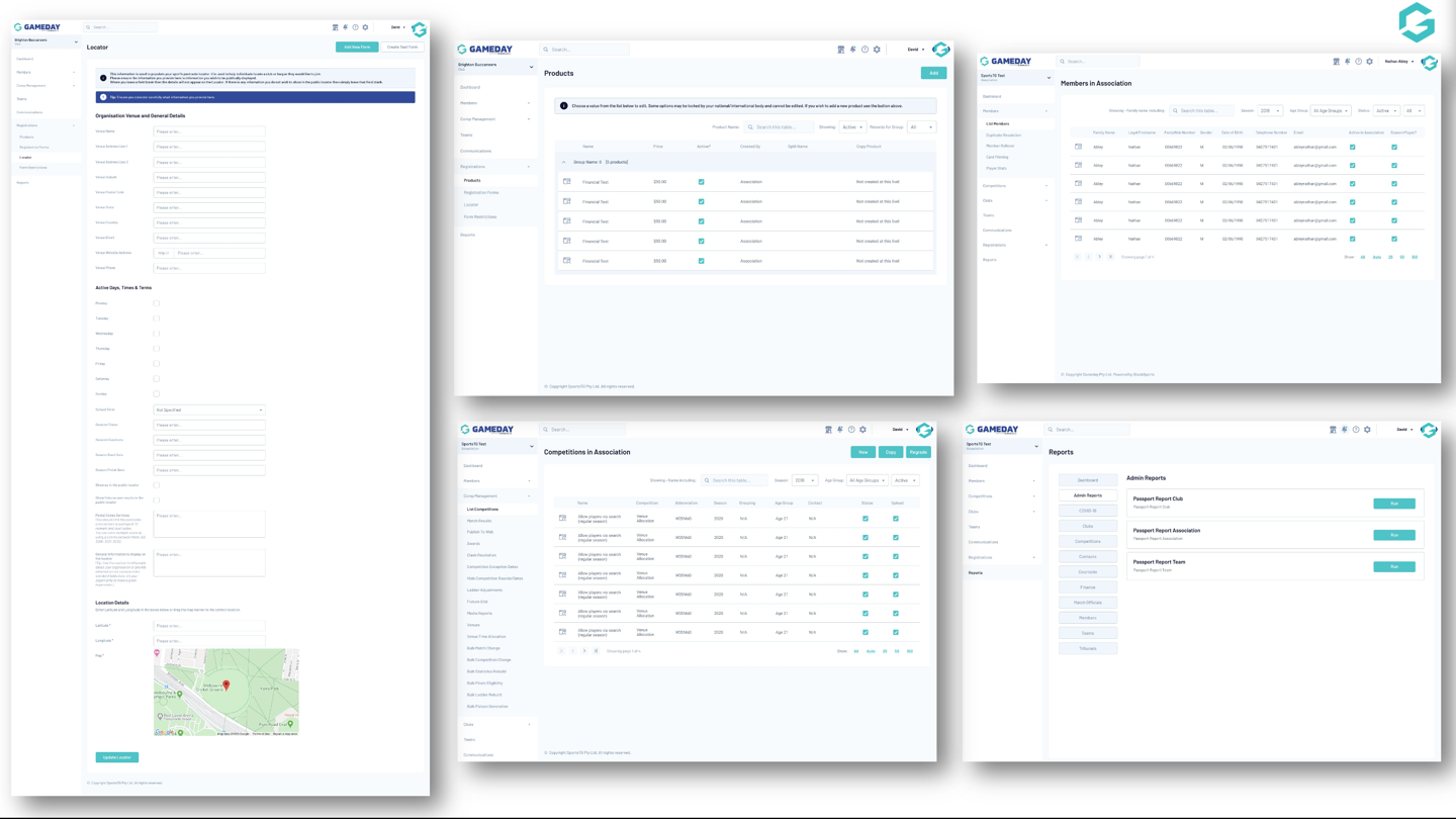 |
| Clockwise from L-R: Organisation Details, Products, Members List, Reports, Competitions List |
Below is list of the related updates we’ve made throughout 2021:
- New-look registration forms (released in February 2021)
- Incorporate the new GameDay brand, look and feel via GameDay Passport login & Account pages (released in March 2021)
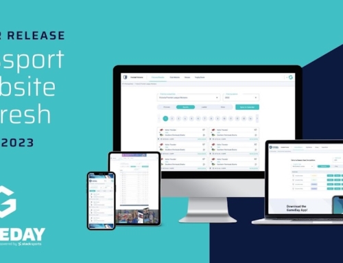
- Passport Website Site Editor UI/UX Refresh (released in June 2021)
- Mobile First Online Results (released in July 2021)
- Updates to GameDay Passport URLs (released in July 2021)
- GameDay Marketplace (released in July 2021)